Wednesday, 11 July 2012


Meet Terra she is caught in a zombie attack and I was thinking it would be funny to make a few character who were so not prepared. Terra was sitting well more like dancing in just her underwear, socks and that top when zombies got into her house, well she got out with her trusty baseball bat and managed to escape so she is now walking the streets dressed like that xD while another character Marilyn whose a model and was in the middle of a photoshoot so she is dressed in high heels and a short short strapless dress xD
Might try and make it like a mini comic of these two trying to help each other survive x3 just something fun 


Thursday, 5 July 2012

Tuesday, 8 May 2012


These are just some stuff I've doodled, the middle one is the most recent : )

Tuesday, 17 April 2012


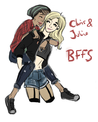
Chris and Julie are two new characters who are elementals C :
while the bottom picture is Jess my girlfriends character ~


Some more of my art. Its been a while since I last updated this blog :D so here we have Pin  Up and My little pony friendship is magic : D

Monday, 5 March 2012

Vogue cover 6
This one is simple yet simply beautiful in my own opinion. I really love the way that the text in the eye slot was accidental, it actually does work really well. The frame next to the image blends in and the darker backdrop shadow gives it a nice finish.
Vogue Cover 5
This one I do love mainly for the image, I am mainly just pleased with how the anatomy of the woman turned out, and how the shoes turned out as well. It all worked out rather well in my opinion and the text for Vogue really stands out with a light colour and the blue from the image as the backdrop shadow of the text it does work rather well.
Vogue cover 4
This one is my absolute favourite one, it has a lovely look to it and it looks very elegant. The text over the image were brushes I have on my own version of GIMP and they fit in the image. The mouth showing in the mirror does have a nice effect in the entire piece and it is rather stunning if I do say so myself.
Vogue Cover 3
Again the main colour theme is blue but personally I do like that about them, it gives them a sense of they are my own work with using different shades of blue and grays in them. My favourite thing about this aside from the figure of course which I am very proud of and very pleased that i managed to draw something like this with my skills not being at my best ability, the thing I love the most is the blue flower in the background that I scanned in as well as the entire background as well, I changed the colour of the flower to make it brighter from the dull colour that it was when I it scanned in. 
Vogue Cover 2
I do like this one, I like the frame around the image of the man in the chair. I used a page from a Sherlock Holmes book to put behind the image and also I used acyrilc paint to go over some areas. Again the composition in this one is very good, and I do like how the main colour theme seems to be blue and how it all blends together and it works really nicely.
Vogue cover 1
One of my vogue covers that I am very pleased with, the blue and then using the orange to stand out on certain areas really works well and blends into the actual piece, and I also like the fact that the image is much larger than the actual background, I am proud of the composition.
This piece I used the colour scheme of toffee cheese cake, the cream, orange rust colour and the browns really complimented each other and it seemed like a fun colour pallet to use and I am also very proud of the outcome. 

Monday, 6 February 2012

Concept designs for my own version of Beauty and the beast.
Giselle a young french dancing girl who wants to be a singer and a actress at broadway! she wants to see her name up in lights. 
Henri the smar, shy, rich and timid man who was born with a face deformity, who helps gives Giselle confidence to follow her dream and they both go to American.
Robert a broadway director who wants Giselle as his 'woman' and he tricks Henri into thinking that Giselle could never love him for he isn't handsome or rich. ( the bad guy of the story)

Sunday, 5 February 2012

This is just testing out colouring and a different way to colour 

Tuesday, 31 January 2012

This is one of the designs that I used for one of my wood block prints.
A peacock frame, the surrounding area will be black while the circles will be white and therefore stand out since they will contrast to the blackground. The peacock its self will be vibrant colours, like the blues, greens and purples that you usally find on a peacock.


These are more mix media art that i have made using parcel paper as the main material.
The top one I tried to give more of a old photo look with the corners like how they are as though they are keeping the picture still.
And again using white acrylic used as lighting on the figure.

While the bottom one is a 1920s women in a man's suit, her waist coat cut out and then the paged layoured ontop of the parcel paper and the parcel paper coming through where its been cut, and also using it as a boarder as well.


These two are my favourites one done on parcel paper.
The bottom one was more accidental than the top one, with the eyes being cut out and going over the words the art which really works well with the piece its self. The white acrylic looks really nice on her hair as well, working like shine on her hair.

Wednesday, 25 January 2012

These are my new attempts at working at mix media for my current project at college. 

I really like how the top one turned out, it was my first attempt and it turned out very well and it has a nice feel to it. While the second one is a bit less effective to the first one but it does have its own little charm.

Now this green one is one I very much like. It was fun to make, since I have to cut out the green and blue card and then stick a small part of a book onto the dress for a pattern then rip it off, it was very fun and I do really like this one.

While this one, I do like it but it was my first attempt with using a page from a Sherlock Holmes book. I used pen and news paper for this one but again it is not my favourite though I do like it. I will be doing more but hopefully they will look more straight cut, but I have to admit the roughness of the edges does make them stand out more.

Wednesday, 18 January 2012

This is a front cover I was working on a very long time ago for a personal comic project of mine, about a Angel who got kicked out of heaven and got her wings taken away. So with this front over I wanted to show that the main character Lacy was mischievous, cunning and flirtatious. 


This is a concept art for character for a personal project I had on the go.

Thursday, 12 January 2012

I am rather proud with how the pencil shading turned out.  

These are some quick images inspired by art nouveau and coloured with water colour 

Friday, 6 January 2012

Fashion drawings 
And this one is just using flat colour


 Here is a before and after of a quick sketch I did in pen then scanned in and drew over using a different way of drawing. The lines in the bottom picture are more fast and don't stick out as much as black lines would and so using the darker colour of that area works a lot better. And I was also trying out different angles.
I tried a different style with this. The lines are much more harder and Im really proud with the colouring on the jeans. 

Wednesday, 4 January 2012

This is a work in progress that I drew a while ago but never finished. I was mainly working on shading and lighting with my work.